 Check out Invitation Crush to see Laura & Doug's wedding invites featured on their blog!
Friday, December 24, 2010
Tuesday, November 16, 2010
Eco 911! Logo
I worked with Honey Child Pictures, a boutique film and TV company, to redesign their logo for a web-based educational TV series for kids called Eco 911! -- a new approach to informal STEM (science, technology, engineering and math) education. They really wanted to incorporate the STEM symbols within the logo so that people would really understand the whole concept with one glance. I kept the symbols simple and clean like the font and used a bright blue which I thought complimented the lime green perfectly.

Version 2
This was a runner up choice. They wanted to try having a nature symbol, so I placed this plant symbol within the title, using the same font, but changing the colors to brown and green.
Friday, October 29, 2010
Lauren & Michael - "Paisley" Wedding Set


I designed this wedding invitation set for my cousin Michael and his soon-to-be wife Lauren. I had mocked up a handful of looks for them to chose from for the invite, using their colors of black, white and green, and they decided on this fabulous paisley design. Then, I carried the look throughout the reception and reply cards, as well as the envelope. I used my new favorite font, which resembled the paisley shapes so well.
Of course I had to incorporate their wedding date in the design — 1.1.11. How awesome is that date?!
"I just wanted to say THANK YOU for the amazing invites!!! They are so wonderful and we both truly appreciate it!"
- Lauren
Of course I had to incorporate their wedding date in the design — 1.1.11. How awesome is that date?!
"I just wanted to say THANK YOU for the amazing invites!!! They are so wonderful and we both truly appreciate it!"
- Lauren
"Black & White Garden" Bridal Shower Invite

My aunt had me make this bridal shower invitation for her son Michael's (my cousin) soon-to-be wife Lauren. I used her wedding colors black, white and light green to create this lovely "garden." I loved playing with the font on this invite — especially having the "bridal shower" bleed off the top.
Lauren and Micah

Well, I had fun making all my sister's wedding stationery materials. The wedding was a blast! I can't believe it's all over. I had to post a picture of the happy couple and this awesome bridal party shot taken by her amazing photographer Jason Angelini. Congrats Lauren and Micah!
Monogram

My sister Lauren had Events in Bloom arrange her gorgeous flowers. They used the extra monograms I made for the wedding invitations to wrap around the vases and candles. The monograms definitely gave it that special extra touch.
Photos by: Jason Angelini Photography
Flowers by: Events in Bloom
Saturday, October 23, 2010
Cake Flavor Sign


How amazing is my sister Lauren's cake?! The company used my invitation design for inspiration, using purple butterflies and green vines/leaves. It was just gorgeous—not to mention DELICIOUS!
Also, Lauren had the idea of having a cake flavor sign, so I made it match the invites as well.
Photos by: Jason Angelini Photography
Cake: Let Them Eat Cake
Table Numbers and Name Tags


Lauren's table numbers with her menu on the back. Also, here are name tags I made using these darling butterfly and flower brads.
Photos by: Jason Angelini Photography
Tuesday, October 12, 2010
Wedding Ceremony Program


Wednesday, October 6, 2010
Aidan's Star Wars Birthday Invite


It was fun switching gears from wedding designs to children designs with this invitation for my cousin Jackie's son Aidan's 6th birthday party. Aidan wanted a Star Wars/Darth Vader themed party where his friends could dress up for Halloween. I had fun researching Star Wars fonts, images and terminology!
"Great job on the invites Krista - got sooooo many compliments!"
- Jackie
"Peace of Silver" Logo
I designed this logo for jewelry company Peace of Silver. The owner Katie wanted to incorporate peacefulness with the tree and birds. She also wanted to use these 2 colors and an owl. I love how the font's shapes and movements match that of the tree branches.
Saturday, August 14, 2010
"Vintage Spoons" - Wedding Rehearsal Dinner Invite

This was a fun vintage rehearsal dinner invite I made for my sister's soon-to-be mother-in-law. I started out with the spoons and then came up with the monogram. From there I had the vision of keeping it one color and printing it on an off-white paper. I found this card stock with an embossed border which worked perfectly for the vintage look. The cool antique font also worked so well.
Once I was about done designing the card, it crossed my mind to print the spoons on the front of the envelopes for that extra touch. I love these spoons!
Friday, July 30, 2010
Lauren & Micah - "Vine" Wedding Package


 My sister Lauren's wedding invitation package is finally complete! Using her colors, we decided to have a vine and floral look in a pocket fold style card. The first piece I worked on was the actual invite in the center of the card. I incorporated the date of the wedding in the design and added a touch of purple flowers in the vines. Using my favorite calligraphic font, I made the soon-to-be-married couple's monogram using vine elements.
From there, it was easy to carry the design throughout the rest of the pieces. I had fun making the little map on the directions insert. Then, I met with my printer Poorvi to pick out metallic color swatches for the pocket fold, inserts and layers.
Now I'll be working on her final pieces: rehearsal dinner invites, ceremony booklet, table numbers & listing, and eventually the "thank you" cards.
Friday, July 23, 2010
Wedding Table Listing


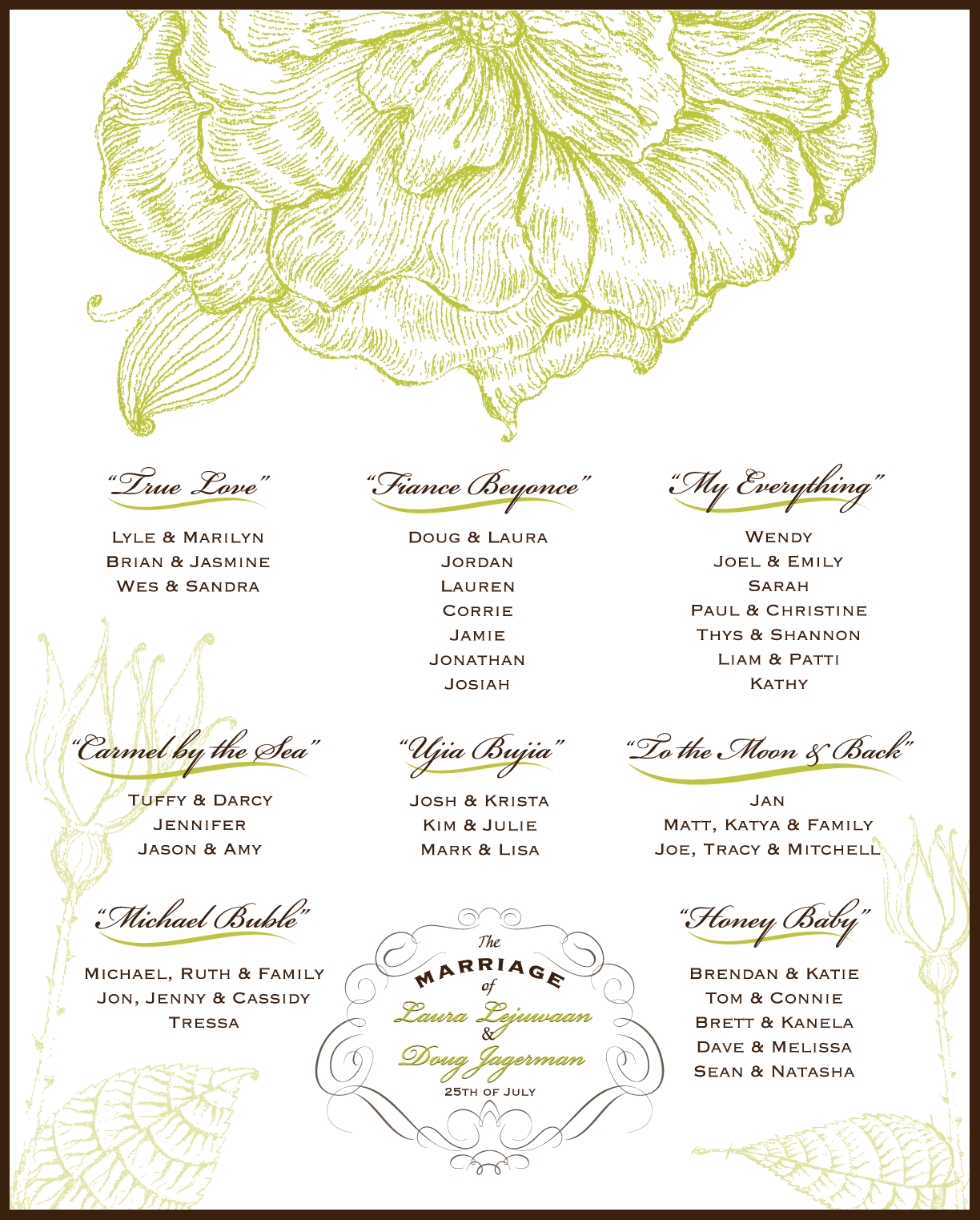
I designed this seating chart for my friend Laura's wedding, matching her invitation. I blew up the flowers and then for the final touch, made the marriage seal with the bride and groom's names at the bottom. I had a lot of fun making this lovely table listing.
Also, here are a few pics from her actual wedding. She used vintage furniture and even scrabble wooden game pieces for the name table tops. I loved the adorable candy table. It was a beautiful wedding!

Wednesday, July 7, 2010
"Bow Dress" Bridal Shower Invite

I designed this invitation for my sister's NJ bridal shower. I drew up this outline of a bride in Illustrator with the idea of adding an actual ribbon to the waistline of the dress. I carried the flower in her hair to the look of the inside of the card.
"Bow" Bridal Shower Invite

I made these bridal shower invites for my sister's soon-to-be mother-in-law. The shower was a tea party theme, so I made them girly and dainty on an off-white card stock. We stuck with my sister's wedding colors, plum and green. For a final touch, I decided to add the ribbon bow.
Friday, June 18, 2010
"Jersey Girl" Wedding Save the Date


I've been working on a whole wedding package for my sister Lauren's wedding in October. The bridesmaids' dresses are plum/eggplant, so we stuck to that color scheme along with green. I've been having so much fun making everything from these save the dates, to bridal shower invites, to the actual wedding invites. Her fiance Micah is from FL and she's a Jersey girl, so I thought this Bruce Springsteen lyric would be perfect. They are also a laid back couple and Micah is a musician, so I made the card more fun rather than formal. The formal part could wait until the wedding invites, which will be posted in about a month- stay tuned :)
Tuesday, June 15, 2010
Laura & Doug - "Vintage Flower" Wedding Invite


I designed this wedding invitation for my friend Laura. She wanted one color, so we experimented with brown, orange and then shades of green, which eventually led to the final decision to use the unique and pretty chartreuse. I love, love, love the beautiful font used for their monogram.
I worked with a great printer, Poorvi at Calico Printing & Graphics, Inc. She creates beautiful custom invitations using pretty metallic paper stocks. She had the idea to round the corners which was a nice added touch.
I had fun taking this montage of pictures using my plant, a piece of palm tree and my watering can which just happened to match perfectly.
Holiday Card

This was a holiday card I designed for my boyfriend and me. We wanted to share our California adventures with our New Jersey family and friends. I'm so glad we decided to spend time here on our San Francisco trip. Muir Woods and the redwoods were just beautiful.
Baptism Reply Card

My sister Danielle ordered Baptism invitations, but needed a custom reply card with meal choices to match what she already had. I matched the pale pink color and thought to add a pretty angel image. Danielle printed these on a nice white textured paper.
WorkCare Save the Date

I designed this save the date for WorkCare's annual dinner event at the American Industrial Hygiene Conference and Expo. I turned a picture of the old Denver restaurant into one color, which gave it that distressed look with the brick and tree elements. I also incorporated the font Rosewood that they have in their banner.
Sunday, February 7, 2010
Haiti Poster
 WorkCare, Inc. needed a poster for their Haiti donation program. Haiti is known for it's rich and diverse culture and distinctive art, especially in painting, so I came up with this concept using Illustrator. I thought the shape of the country resembled the shape of the palm of a hand. Each of its ten departments are represented in a different color. I used blue and red for the background since they are the colors of the Haiti flag.
Subscribe to:
Posts (Atom)
